
Vue大屏适配
Vue大屏适配
- 适配总结 移动web开发
1. 方案:
方案1:css缩- 利用transform:scale 进行适配
大屏自适应容器组件,可用于大屏项目开发,实现屏幕自适应,可根据宽度自适应,高度自适应,和宽高等比例自适应,全屏自适应(会存在拉伸问题)
方案2: rem 适配
amfe-flexible 和 postcss-px2rem-exclude 将px转为rem
参考:https://blog.csdn.net/weixin_44900104/article/details/126890722
说明:
lib-flexible 有个限定不超过540px 所以对应根节点字体最大是54px,所以这里使用 amfe-flexible
postcss-px2rem-exclude 基于老的 PostCSS 5 尽可能的不在使用,目前推荐使用 postcss-pxtorem 替代
2. rem介绍:
rem是CSS3新增的一个相对长度单位。相对于根元素(即html元素)font-size计算值的倍数的一个css单位,也就是我们前端常说的适配单位rem。因为rem的特性相对长度单位,所以常用来做适配
那如何将px转化为rem呢??? 这里就引出我们需要用的两个插件:
- 使用postcss-px2rem-exclude可以将项目中的px自动转换成rem
- amfe-flexible则可以根据不同型号的手机,进行相应的HTML根节点(font-szie)的初始化。
3. 实现步骤:
3.1 amfe-flexible 和 postcss-px2rem-exclude 实现
问题 postcss-px2rem-exclude 基于 PostCSS 5无法正常使用
推荐:使用
postcss-pxtorem@5.1.1(兼容 PostCSS 7)
1 安装 postcss-px2rem-exclude
推荐使用 postcss-plugin-px2rem
npm install postcss-px2rem-exclude --save
2 安装 amfe-flexible
npm install amfe-flexible --save
3在vue项目中的main.js导入amfe-flexible
import 'amfe-flexible'; / /引入amfe-flexible做rem适配
4 在vue项目中的vue.config.js中配置postcss-px2rem-exclude
module.exports = {
    css: {
        loaderOptions: {
            postcss: {
                plugins: [
                    require("postcss-px2rem-exclude")({
                   // 指定 相对于 HTML 根元素计算 rem 值的基准字号大小 这里取设计稿的10份之一假如设计稿尺寸的屏幕分辨率是1920,则指定 remUnit = 1920/10
                        remUnit: 192, // 设计稿尺寸/10
                        // 根据需要提添加 -- 忽略不需要适配的页面 如果只有一个 用数组的方式肯能不生效 使用  "exclude": /node_modules/
                        exclude: [
                          /node_modules/, // 排除第一个组件
                          /src\/views\/activiti\/wfForm\/addWfForm/, // 排除第二个组件
                          /src\/views\/ydxj\/woOrder\/woOrderModel\/addWoOrderModel/, // 排除第三个组件
                          /src\/views\/ydxj\/woOrder\/woOrderRec\/addWoOrderRec/, // 排除第三个组件
                        ],
                    })
                ]
            }
		}
	}
}
remUnit的配置:
通常我们是根据设计图来定这个值,假如设计图给的宽度是1920,我们通常就会把remUnit设置为192(设计图宽度的十分之一),这样我们写样式时,
可以直接按照设计图标注的宽高来1:1还原开发。
5 内联样式,需要额外处理
元素中的stye 属性是无法转换rem,需要额外处理
写一个px2rem方法,放在全局,在src/main.js里写如下代码:
function px2rem(px){
  if(/%/ig.test(px)){ // 有百分号%,特殊处理,表述pc是一个有百分号的数,比如:90%
    return px
  }else{
    return (parseFloat(px) / 192) + 'rem'
  }
}
Vue.prototype.$px2rem = px2rem // 放到全局
对应的页面的使用方式
 <div class="left">今天是2022年9月16日,天气晴</div>
 <div class="center" :style="{fontSize:$px2rem('30px')}">距离国庆还有14天</div>
 <div class="right">哈哈哈哈哈</div>
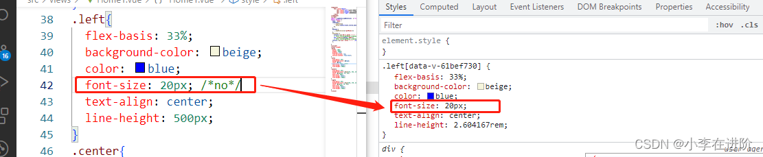
注意事项 :如果你有某些px不想被转换成rem ,那么可以这样做 : 加上/no/ :
肯能不生效,
- 使用大写PX
- 内联样式 也即是直接写在元素中的stye 属性中
3.2 amfe-flexible 和 postcss-pxtorem
- 安装
npm install amfe-flexible --save
npm i -D postcss-pxtorem@5.1.1
入口引入
- 在 src/main.js 顶部引入 amfe-flexible(你项目已引入):
import 'amfe-flexible';
- 在 src/main.js 顶部引入 amfe-flexible(你项目已引入):
viewport
- 在 public/index.html 确保有 meta viewport
<meta name="viewport" content="width=device-width, initial-scale=1, maximum-scale=1, user-scalable=no">
- 在 public/index.html 确保有 meta viewport
PostCSS 配置(vue.config.js)
- 推荐配置(rootValue 对应 1920 设计稿 ÷ 10):
css: { loaderOptions: { postcss: { plugins: [ require('postcss-pxtorem')({ rootValue: 192, // 1920 设计稿推荐 192;若 750 设计稿可用 75 propList: ['*'], // 转换所有属性 exclude: /node_modules/i, // 排除第三方 }), ], }, }, } - 如果要排除多文件/目录(兼容 Win/Unix 路径):
const pxtoremExclude = [
  /node_modules/i,
  /src[\\\/]views[\\\/]activiti[\\\/]wfForm[\\\/]addWfForm/i,
  // ...更多
];
require('postcss-pxtorem')({
  rootValue: 192,
  propList: ['*'],
  exclude: (file) => pxtoremExclude.some(re => re.test(file)),
})
- 推荐配置(rootValue 对应 1920 设计稿 ÷ 10):
rootValue 选择
- 1920 设计稿 → 192(等于设计稿宽度/10)
- 750 设计稿 → 75
- 换算:1rem = 设计稿宽度/10 px;例如 width: 960px → 960/192 = 5rem
使用与校验
- 代码中正常写 px,构建时自动转 rem
- 运行后查看元素 computed style,确认 px 已变为 rem
- 控制台/构建日志无 PostCSS 版本冲突
常见问题
“PostCSS 版本不匹配”:
- Vue CLI4 链路锁定 PostCSS 7,需用兼容插件版本(postcss-pxtorem@5.x)
- 部分样式没转:
- 检查是否被 exclude 排除了
- 内联样式/第三方库通常不转
- !important 与优先级覆盖不影响单位转换,但会影响最终展示